# Lesson 22: Global CSS and design tokens
Right, here we are, in the final module of this course. This is actually my favourite part—writing CSS.
Of course I enjoy Eleventy, but I’m a designer by trade, so the part where we make stuff look good is naturally going to be the part I enjoy the most.
If you haven’t already: I strongly recommend that you read this post that I wrote on CUBE CSS (opens new window).
The main reason is that this is how we’re building the CSS for this site and it’ll be really helpful to be aware of the methodology behind it.
# Starter files
The first thing we need to do in this module is apply our starter files, just like we did right at the start of the course. This just gets some of the more boring aspects like configuration out of the way.
Download the starter files (opens new window) and completely replace eleventy-from-scratch/src/scss with the scss folder in the ZIP archive that you downloaded.
Your eleventy-from-scratch/src/scss folder should now look like this:
scss
├── _config.scss
├── _reset.scss
├── blocks
├── critical.scss
└── utilities
# Installing Gorko
To make working with the CUBE CSS methodology easier, I created a Sass tool called Gorko (opens new window). It generates utility functions for us based on a configuration file. This allows us to have a single source of truth for our CSS.
We’ll take a look at various parts of Gorko as we come to them throughout this module, but first, let’s install it.
Open your terminal in eleventy-from-scratch and run the following command:
npm install gorko
Now that’s installed, open up eleventy-from-scratch/src/scss/critical.scss and add the following to the top of the file:
// First up: config and functions
@import 'config';

// Next: pull in gorko for design tokens
@import '../../node_modules/gorko/gorko.scss';
The first thing we do is import our _config.scss file, then grab Gorko out of the node_modules.
# A quick tour of your scss folder
I’m going to quickly show you around the current scss folder so you know:
- what’s going on
- what the purpose of each file and folder is
- how it all comes together
TIP
During this section, we’re just looking at the code so you don’t need to copy any of it to your project. I’ll let you know when you need to start copying code again.
# Configuration
Take a quick look at eleventy-from-scratch/src/scss/_config.scss. Let me explain what’s going on.
The first thing you’ll notice is that there are a lot of comments. Rightly so, too, because this file is the beating heart of our CSS.
The first variable that we see is $gorko-base-size. This is set to 1rem. A REM Unit is a flexible unit that is based on the user’s system font size. If a user has made no changes to their system font size, this will be around 16px. There’s even more complexity around that calculation, but don’t worry, we’ve got your back over on Every Layout where we wrote a heck of a long post about units (opens new window) which you should read.
This base size does exactly what you'd expect it to: it’s the size that everything is based on. The best way to explain that is to show you this:
$gorko-size-scale: (
  '300': $gorko-base-size * 0.75,
  '400': $gorko-base-size,
  '500': $gorko-base-size * 1.33,
  '600': $gorko-base-size * 1.77,
  '700': $gorko-base-size * 2.36,
  '800': $gorko-base-size * 3.15,
  '900': $gorko-base-size * 4.2,
  'major': $gorko-base-size * 5.6
);
This is a size scale. We generate 8 sizes for the scale, which is a perfect fourth scale (opens new window). This translates into handy utilities, both as utility classes that we apply to HTML and also helper functions in our Sass code.
The whole idea of a size scale is to create harmony and balance. We, as designers have been using typographic scales for centuries to do exactly this. We push this methodology even further now, with CUBE CSS (opens new window) and use that scale to size typography, margin and padding, amongst other things. This makes a huge difference in not only visual harmony, but to the amount of code that we write, too. Generally, working with a system like this results in much less layout code!
After our size scale, we define $gorko-colors, which are pretty self-explanatory. There are 7 different colours all with a glare and shade variant. The glare variant is lighter and the shade variant is darker than the base colour.
We then finish up at $gorko-config which defines two key things for us: utility classes and breakpoints. The main thing is the utility classes.
If you look down the config, you’ll end up at this:
'gap-top': (
  'items': $gorko-size-scale,
  'output': 'responsive',
  'property': 'margin-top',
),
'leading': (
  'items': (
    'loose': 1.7,
    'tight': 1.3,
    'flat': 1.1,
  ),
  'output': 'standard',
  'property': 'line-height',
)
For each one of these blocks a utility class is generated. Let’s take the first one, gap-top. It uses the size scale, which means for each size, a utility class is generated, like this:
.gap-top-400 {
  margin-top: 1rem;
}

.gap-top-500 {
  margin-top: 1.33rem;
}
The class uses margin-top because that’s what we define in the property key. There are two options for output, too: standard or responsive.
standard will just generate the utilities as you define them. For example, the leading utility in that example code will only generate 3 utility classes. responsive, however, will generate the same utility for each breakpoint that’s defined in breakpoints. Let’s have a quick look at them.
'breakpoints': (
  'md': '(min-width: 37em)',
  'lg': '(min-width: 62em)',
)
We have two breakpoints here, which directly translate into media queries. For example, md directly translates to this:
@media (min-width: 37em) {
}
Back to the context of our responsive utilities, we get a version for each breakpoint, so the gap-top utilities look more like this:
.gap-top-400 {
  margin-top: 1rem;
}

.gap-top-500 {
  margin-top: 1.33rem;
}

.md\:gap-top-400 {
  margin-top: 1rem;
}

.md\:gap-top-500 {
  margin-top: 1.33rem;
}

.lg\:gap-top-400 {
  margin-top: 1rem;
}

.lg\:gap-top-500 {
  margin-top: 1.33rem;
}
The \ escapes the : for us, which makes it valid CSS. We then apply the classes like this:
<p class="gap-top-400 md:gap-top-500">I have responsive spacing</p>
This means that by default, we use the 400 size in our size scale to space elements, but if the viewport is equal to or greater than 37rem, we use the 500 size instead. Pretty handy, right?
# Blocks and utilities
As per the CUBE CSS methodology (opens new window), we have blocks and utilities. Gorko (opens new window) and our config have at this point generated most of the utilities, but you’ll see that there are a few set for us in eleventy-from-scratch/src/scss/utilities.
These utilities do one job for us, and they do it well. For example, the .wrapper utility creates a horizontally centered container that has a max-width. The .radius utility applies a consistent border-radius to the elements it’s applied to.
Next, we have blocks, which are like components. Blocks are specific CSS, but as you can see in the existing files, like _tags-list.scss, they’re pretty darn lightweight. This is because in most cases, the rest of our CSS has already done the hard work for us. We’ll be writing more complex compositional blocks soon, though.
# Critical, global CSS
Now that we’ve had a bit of a tour, it’s time to start writing some code.
TIP
From now on in this lesson, you should implement the code samples that we look at.
Open up eleventy-from-scratch/src/scss/critical.scss add the following after the reset, on around line 8:
// Global styles start
:root {
  --flow-space: #{get-size('600')};
}

body {
  background: get-color('light');
  color: get-color('dark-shade');
  line-height: 1.5;
  font-size: get-size('500');

  @include apply-utility('font', 'base');
}

a:not([class]) {
  color: currentColor;
  text-decoration-color: get-color('quinary');
}

:focus {
  outline: 2px dashed get-color('primary');
  outline-offset: 0.25rem;
}

main:focus {
  outline: none;
}

h1,
h2,
h3,
h4 {
  font-weight: 900;

  @include apply-utility('font', 'sans');
  @include apply-utility('leading', 'flat');
}

// High contrast selection because it can help visually-impaired
// folks read the text easier
::selection {
  color: get-color('light');

  // We set this as an RGBA because that’s how you get a solid color, by using 0.99
  // alpha value. Browsers are wild.
  background: rgba(get-color('dark-shade'), 0.99);
}

// Scrollbar styles
::-webkit-scrollbar {
  height: 1rem;
}

::-webkit-scrollbar-track {
  background-color: transparent;
  border: 1px solid get-color('dark-glare');
  border-radius: 0.25rem;
}

::-webkit-scrollbar-thumb {
  background-color: get-color('dark');
  border-radius: 0.25rem;
}
There’s a lot happening here, so let’s do a breakdown:
- The first thing we do is set a
--flow-spacecustom property at the root. This is what controls the.flowutility, which we’ll talk about some more in the next lesson. - Next, we apply some styles to HTML elements, like the
<body>. Gorko provides us with useful functions and mixins to apply our config values in our code. In this example we’re usingget-size, which grabs the value of our size scale, based on the key and thenapply-utilitycalculates the value of a pre-generated utility class, just like ourgap-topone from earlier. There’s also aget-colorutility, which grabs a colour by key, much likeget-size. - We then move onto
::selectionstyles. These are the styles that get applied when a user highlights text with their pointing device, such as a mouse. To provide high contrast, we set a dark background and light text. This is because some users highlight text to make it easier to read, so by setting rules like this, we’re giving them a helping hand. - Finally, we style our scrollbars. This will apply not just to the main scrollbar on the right, but also to the horizontal scrollbars which we’ll be seeing soon.
Now, if you haven’t already, run npm start in your terminal, in the eleventy-from-scratch folder.
When you open up your browser at http://localhost:8080 (opens new window), it should look like this:
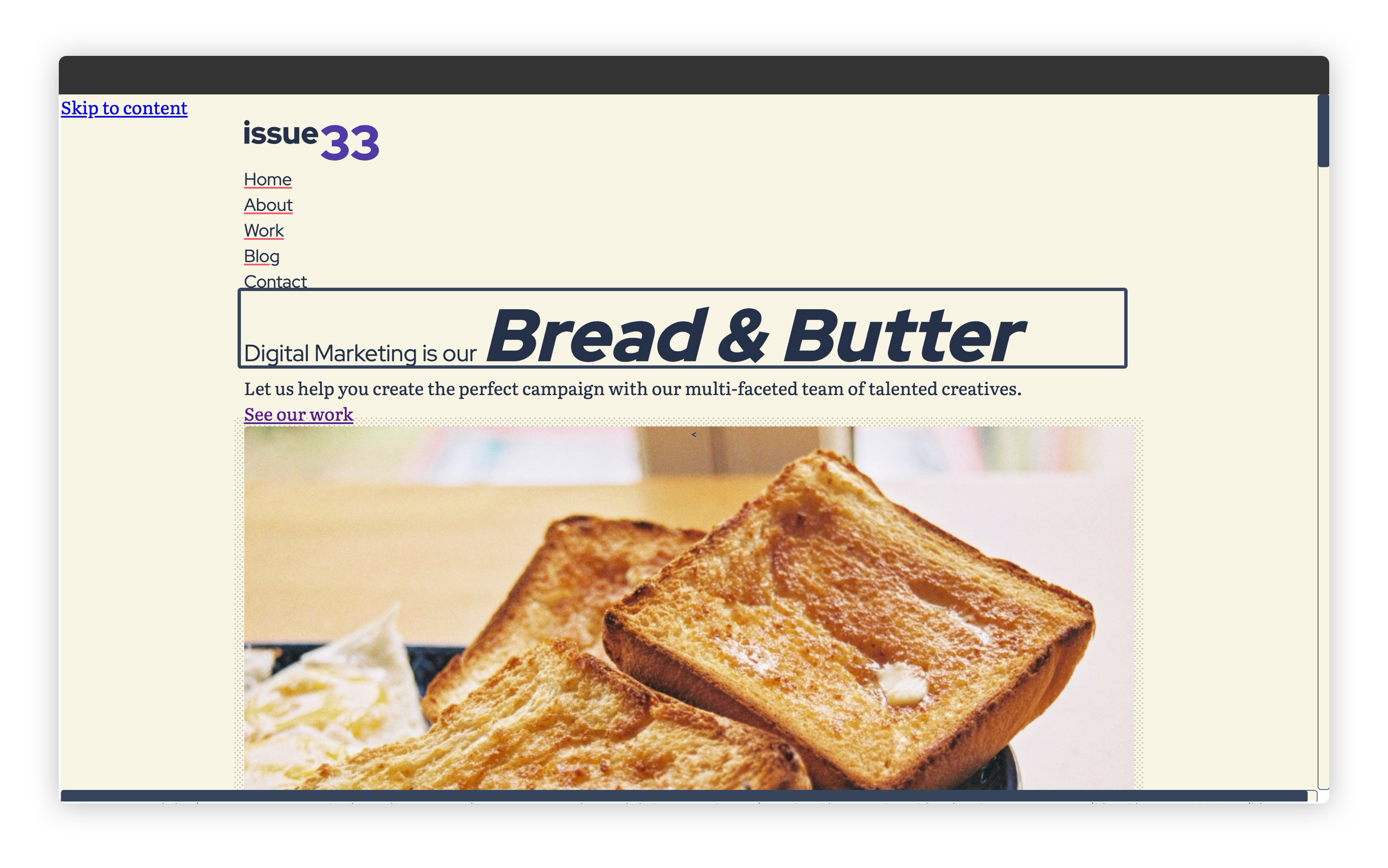
You might be wondering why it looks so styled already? This is the magic of CUBE CSS (opens new window). You might remember in the first module, all the markup that we added already contained the CSS classes that we are now applying CSS to. Most of those were utility classes that apply design tokens for us, so a lot of the hard work with CSS is already done.
# Wrapping up
That was a heck of a tour, right? Now you hopefully understand roughly how the CSS works on this project, you should feel a lot more comfortable during the next few lessons as we apply more.
We’re only just getting warmed up with CSS and there’s a lot more to learn, so don’t fret: there’s plenty of time yet.