# Lesson 25: Home page intro
CSS Grid (opens new window) is a powerful layout tool that’s supported by the vast majority of browsers. Historically, it’s proven pretty difficult for folks to get their heads around, including me, so let’s try to change that.
In this lesson, I’m going to teach you how to build a pretty cool layout with CSS Grid that’s a bit of a brain teaser. Hopefully by the end of this lesson, you’ll feel a bit more comfortable with CSS Grid than when you started.
# What we’re building
On our home page we have a block called intro that morphs into different layouts depending on the viewport it finds itself in. Let’s take a quick look at it in a responsive design tool I like to use called Sizzy (opens new window), which lets us create multiple different responsive contexts on one screen:
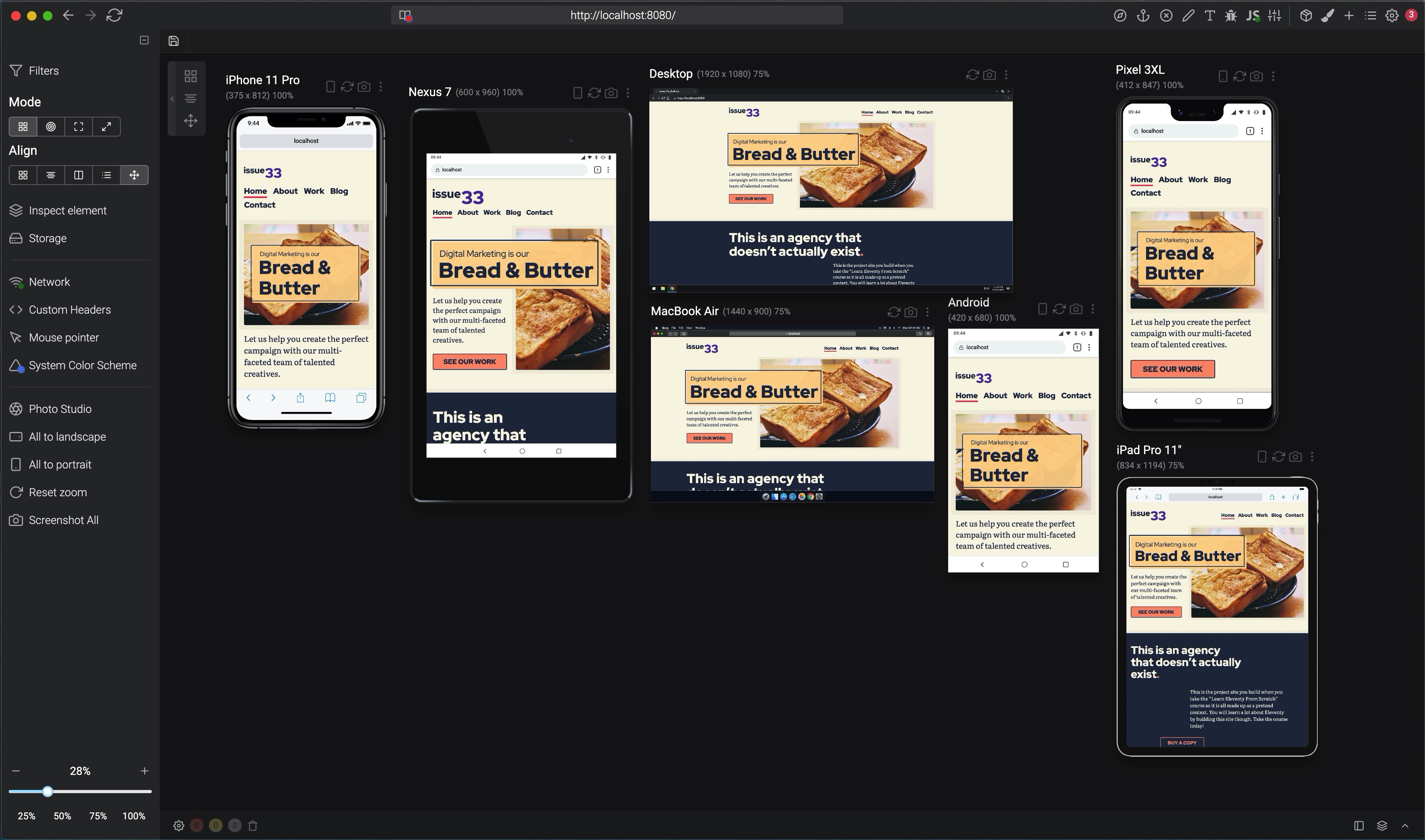
There’s a lot going on, right? Let’s build it!
# Wiring up our block and critical CSS
This intro only appears on the home page, so we’re going to first create a home.scss file.
In your scss folder, create a new file called home.scss and add the following to it:
// First up: config and functions
@import 'config';

// Set Gorko to output no CSS for this file
$outputTokenCSS: false;

// Next: pull in gorko for design tokens
@import '../../node_modules/gorko/gorko.scss';

// Pull in blocks
@import 'blocks/intro';
This is almost identical to our critical.scss file, but the difference here is that we’re instructing Gorko (opens new window) not to generate utility classes by setting $outputTokenCSS to false.
We need to add the block now, so create a new file in your blocks folder called _intro.scss and add the following to it:
.intro {
  // Default is a single column layout where the header overlaps the media
  display: grid;
  grid-template-rows: get-size('700') minmax(0, 1fr) get-size('700') auto;
  grid-gap: get-size('500');

  // Force items to span 1 column
  > * {
    grid-column: 1;
  }
}
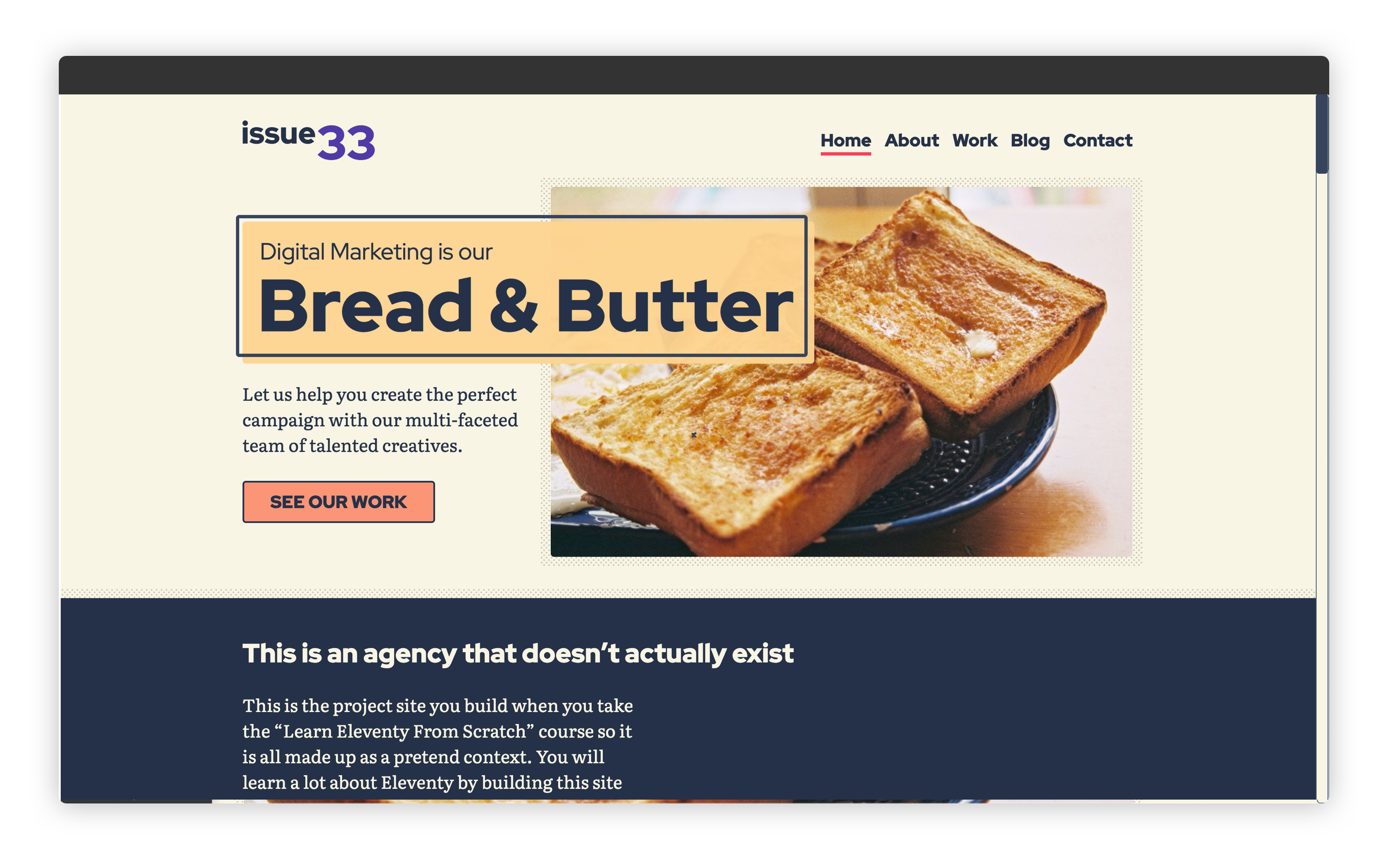
This is our default CSS. Even though we’re in a one column layout, we still use Grid. This is mainly because we want our headline to overlay the image. This is what we’re after:

The first thing we do is set our rows up. The first row uses a size token (get-size('700')) because we want a bit of our image to display on its own first. Then we use minmax(0, 1fr) which allows the next row to grow to 1 part of the available remaining space. But importantly, it can be 0 if there’s nothing in it.
Following this is another explicitly sized row that uses a size token again, to allow some image to show through. This is followed by an auto row for the content and button.
We then use a direct child selector: > * to select only the direct children and force them to span the entire width with grid-column: 1.
Right, let’s get funky now.
Open up eleventy-from-scratch/src/scss/blocks/_intro.scss and just before the end of the block closing bracket, at around line 11, add the following:
&__header {
  padding: get-size('300') get-size('500');
  background: rgba(get-color('tertiary'), 0.95);
  z-index: 1;
  grid-row: 2;
  margin: 0 get-size('500'); // Adds a horizontal gutter

  // Prevents it from stretching to fill the space
  align-self: center;
}

&__heading {
  em {
    font-style: normal;
    display: block;

    // The weight change creates a weird indent, so this
    // optical adjustment fixes it
    transform: translateX(-3px);
  }
}

&__media {
  grid-row: 1/4;
  position: relative;

  img {
    width: 100%;
    height: 100%;
    object-fit: cover;
  }
}

&__content {
  grid-row: 4;

  p {
    max-width: 30ch;
  }
}
Brush aside some of the core visual CSS for a moment, because that stuff is pretty self-explanatory. Instead, focus on the grid-row for each of these elements, where defined. As explained before, we’re specifically telling our elements which row to place themselves on.
For example, we wanted the &__header to appear over the image. The first step to doing that is telling the header to sit in row 2, with grid-row: 2. Then, we tell our image to span from row 1 to the start of row 4 with grid-row: 1/4.
TIP
Understanding how grid rows, columns and grid lines work is really hard. I strongly recommend that you check out this fantastic resource, by Rachel Andrew, called Grid By Example (opens new window).
I constantly refer to it myself.
Right, let’s expand this layout for larger screens.
Open up eleventy-from-scratch/src/scss/blocks/_intro.scss and straight after the last bit of code we added, on around line 52, add the following:
// Switch to an inline layout with some vert space
// above the header and content
@include media-query('md') {
  grid-template-rows: get-size('500') auto auto auto;
  grid-template-columns: minmax(15rem, 1fr) 2fr;

  &__header {
    padding: get-size('500');
    margin: 0;
    grid-column: 1/3;
    justify-self: start;
    align-self: end;
  }

  &__media {
    grid-column: 3/2;
    grid-row: 1/5;
  }

  &__content {
    grid-row: 3/4;
    grid-column: 1;
  }
}
Here we’re expanding the layout for our md breakpoint, which is essentially tablet and up. Notice the grid-template-columns and grid-template-rows part? What we’re doing here is making our grid 4 rows high, with the first row being explicitly sized. This gives us a nice little vertical offset. Then, we’re making this a two column layout.
We want the content to be narrower than the image so we’re splitting it 1fr and 2fr. Remember, an fr is exactly one part of the available remaining space. We’re doing a magic trick here, too, by using minmax to say “make sure the element is at least 15rem wide. If it is, fill the space up to 1fr only”. This allows us some control to make sure that the content will still be legible if things get a bit tight.
Let’s take a look at this diagram where I’ve drawn the grid lines:

The fourth row is chopped off the end of this viewport, but hopefully those lines help you to visualise how the grid now looks.
In the code above, we’re setting both rows and columns for our elements to place them where we want to place them. As always, the &__header gives us the most interesting CSS. We tell it to fill the entire grid with grid-column: 1/3. You might be thinking “that’s weird because the grid is only two columns wide”, right? By using 3, we are saying, “end on grid line 3” which sits at the end of our defined grid.
We use justify-self: start to break the default justification of stretch. This means our header will only display as wide as the content within it. This works very much the same as flexbox does.
Finally, we achieve the overlap again because our header and image share the same column and row space. We make the image fill all the rows by setting grid-row: 1/5. This works the same as the header and its columns.
Ok, nearly there. Let’s wrap up by adding some code for larger breakpoints. Open up eleventy-from-scratch/src/scss/blocks/_intro.scss and add the following after the last bit of code, on around line 78:
// Flip the ratio for larger breakpoints
@include media-query('lg') {
  grid-template-columns: 1fr minmax(44rem, 1fr);

  // Because it's so large, it make sense to limit the image height too
  &__media {
    height: 28rem;
  }
}
Because we have more room now, we change the column layout to be more 50/50 instead. We use minmax to make sure our image is at least 44rem wide. Then, finally, we give our image a fixed height.
When all of that is in, your _intro.scss file should look like this:
.intro {
  // Default is a single column layout where the header overlaps the media
  display: grid;
  grid-template-rows: get-size('700') minmax(0, 1fr) get-size('700') auto;
  grid-gap: get-size('500');

  // Force items to span 1 column
  > * {
    grid-column: 1;
  }

  &__header {
    padding: get-size('300') get-size('500');
    background: rgba(get-color('tertiary'), 0.95);
    z-index: 1;
    grid-row: 2;
    margin: 0 get-size('500'); // Adds a horizontal gutter

    // Prevents it from stretching to fill the space
    align-self: center;
  }

  &__heading {
    em {
      font-style: normal;
      display: block;

      // The weight change creates a weird indent, so this
      // optical adjustment fixes it
      transform: translateX(-3px);
    }
  }

  &__media {
    grid-row: 1/4;
    position: relative;

    img {
      width: 100%;
      height: 100%;
      object-fit: cover;
    }
  }

  &__content {
    grid-row: 4;

    p {
      max-width: 30ch;
    }
  }

  // Switch to an inline layout with some vert space
  // above the header and content
  @include media-query('md') {
    grid-template-rows: get-size('500') auto auto auto;
    grid-template-columns: minmax(15rem, 1fr) 2fr;

    &__header {
      padding: get-size('500');
      margin: 0;
      grid-column: 1/3;
      justify-self: start;
      align-self: end;
    }

    &__media {
      grid-column: 3/2;
      grid-row: 1/5;
    }

    &__content {
      grid-row: 3/4;
      grid-column: 1;
    }
  }

  // Flip the ratio for larger breakpoints
  @include media-query('lg') {
    grid-template-columns: 1fr minmax(44rem, 1fr);

    // Because it's so large, it make sense to limit the image height too
    &__media {
      height: 28rem;
    }
  }
}
Now the last thing we need to do is define a page critical style for our home page. We covered this in the last module when we set our Sass up. The Sass part is now done, we just need to make base.html aware that there’s a critical CSS file to add to the pile.
Open up eleventy-from-scratch/src/_includes/layouts/home.html and on line 2 add the following:
{% set pageCriticalStyles = ['css/home.css'] %}
Your intro layout should look like this, when you open http://localhost:8080 (opens new window):
# Wrapping up
That was a heck of a lesson, right? I really want you to walk away from this course not just with kickass Eleventy knowledge, but also kickass front-end, specifically CSS, knowledge.
We’re going to fill out the rest of the home page CSS in the next lesson which—you guessed it—will have lots more grid!