# Lesson 26: Home page panels
Let’s dive right in with our first panel: the call to action. If you remember from earlier in the course, this is a global call to action that appears on most of the pages in our site.
Thanks to the CUBE CSS (opens new window) methodology, most of this panel styling is done. All we need to do now is add some compositional CSS and a utility that provides us with a consistent heading style.
# Call to action block
Create a new file in your blocks folder called _cta.scss and add the following:
.cta {
  // This is a dark panel, so we need to flip the selection styles
  ::selection {
    // We set this as an RGBA because that’s how you get a solid color, by using 0.99
    // alpha value. Browsers are wild.
    background: rgba(get-color('light'), 0.99);
    color: get-color('dark-shade');
  }

  @include media-query('md') {
    &__inner {
      display: grid;
      grid-gap: get-size('700') get-size('500');
      grid-template-columns: repeat(12, 1fr);

      @supports (display: grid) {
        > * {
          margin: 0;
        }
      }
    }

    &__heading {
      grid-column: 1/9;
    }

    &__summary {
      grid-row: 2;

      // Pull the content in from the right, by reversing columns
      grid-column: 12/5;
    }

    &__action {
      grid-row: 3;
      grid-column: 3/12;
    }
  }

  @include media-query('lg') {
    &__inner {
      grid-gap: get-size('500');
    }

    &__summary {
      grid-column: 12/7;
    }

    &__action {
      grid-column: 6/12;
    }
  }
}
The first thing we do is flip the ::selection styles. The global selection styles won’t work because this panel has a dark background. Notice how we use rgba to make a .99 opacity version of this colour? Yep, that’s some browser weirdness (opens new window) that we have to get over. Luckily, Sass allows us to pass a token into the rgba function.
At md and up, we introduce CSS Grid again. This time, we create a 12 column grid and use grid-column and grid-row to place content where we want it, just like we did with the intro. This enables us to create a pretty funky offset layout.
There’s also some progressive enhancement in action. By default, the call to action uses the .flow utility. This utility adds margin to each sibling element. This works fine for old browsers and smaller viewports where all we want is vertical space between items, but it does become a problem in our grid.
TIP
I wrote a post about the flow utility (opens new window) a couple of years ago. You should definitely check it out, because I use the utility all the time and it is everywhere on this site.
We also created The Stack in Every Layout (opens new window) which uses a very similar principle.
To fix this layout issue caused by .flow, we use @supports to detect grid support. If support exists, we remove the margin from the direct children of our .cta block, which allows grid-gap to take full control of the spacing.
TIP
Fancy a challenge? Go back to the .intro block and try to implement .flow and then progressively unset it using the same technique as above.
Right, let’s make the headline look good.
# Headline utility
Almost every heading on this site looks the same in terms of size, so it makes sense to create a global utility that responsively applies the correct design tokens, based on viewport.
Create a new file in your utilities folder called _headline.scss and add the following to it:
$headline-highlights: ('dark', 'primary', 'secondary', 'quaternary', 'quinary');

.headline {
  font-size: get-size('700');
  max-width: 18ch;

  @include media-query('md') {
    font-size: get-size('800');
  }

  @include media-query('lg') {
    font-size: get-size('900');
  }

  &::after {
    content: '.';
  }

  // For each color, create an exception
  @each $headline-highlight in $headline-highlights {
    &[data-highlight='#{$headline-highlight}'] {
      &::after {
        color: get-color($headline-highlight);
      }
    }
  }
}
The first thing we do is apply font sizes for each breakpoint and then add a full stop at the end, using the &::after pseudo-element. So far, so simple.
To make things interesting, we generate the heading exceptions (opens new window) using a Sass map. The map is $headline-highlights and it's essentially an array of design tokens for colour. We then—using an @each loop—generate a [data-highlight] exception for each colour. This means that the full stop will have a design token applied to it to make it a different colour than our text. For example, this headline element has data-highlight="quaternary" in the HTML.
# Adding our CSS to critical CSS
The call to action is used everywhere on the site, so we’re going to add it to our global, critical CSS. Open up eleventy-from-scratch/src/scss/critical.scss and add the following, with the other block @import statements:
@import 'blocks/cta';
Then, on line 92 add the following, with the other utility @import statements:
@import 'utilities/headline';
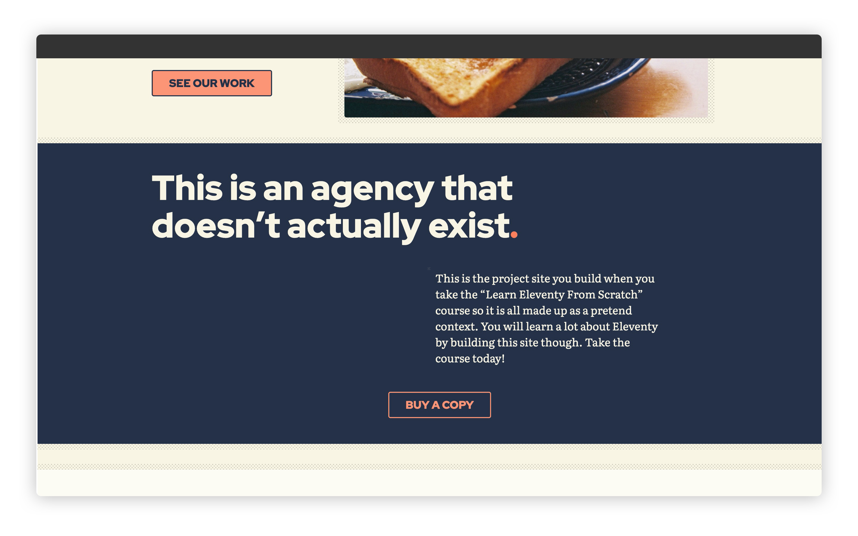
When you load up your browser at http://localhost:8080 (opens new window) and scroll down to the call to action, it should now look like this:
# Featured work feed
Let’s make that feed of featured work look good. Create a new file in your blocks folder called _featured-work.scss and add the following to it:
.featured-work {
  &__item {
    display: block;
  }

  &__action {
    text-align: center;
  }

  @include media-query('md') {
    &__inner {
      display: grid;
      grid-template-columns: repeat(12, 1fr);
      grid-gap: get-size('700') get-size('500');

      @supports (display: grid) {
        > * {
          margin: 0;
        }
      }
    }

    &__intro {
      grid-column: 1/13;
      align-self: end;
    }

    &__item {
      &:nth-child(odd) {
        grid-column: 1/8;
      }

      &:nth-child(even) {
        grid-column: 13/6;
      }
    }
  }

  @include media-query('lg') {
    grid-template-columns: repeat(2, 1fr);

    &__intro,
    &__item {
      &:nth-child(odd) {
        grid-column: 1/7;
      }

      &:nth-child(even) {
        grid-column: 13/7;
      }
    }
  }
}
Guess what? We’re using Grid again! This time, we use it to create a lovely staggered layout at medium viewports (the md breakpoint).
Using :nth-child(odd) and :nth-child(even), we place the items either out to the right or to the left. To place items to the right, we reverse our grid-column rule to be 13/6. This means we want it to start at grid line 13 and finish at grid line 6, which makes it align to the right. Cool, right?
Finally, at the largest breakpoint, we convert this to a standard two column grid and use :nth-child(odd) and :nth-child(even) to place the items each side. Since we used these in the previous breakpoint, it makes sense to use them again because we’re in a bit of a specificity pickle otherwise. It also makes the code a bit more predictable, which is always a good thing.
Let’s add that to our home critical CSS. Open up eleventy-from-scratch/src/scss/home.scss and right at the end, add the following:
@import 'blocks/featured-work';
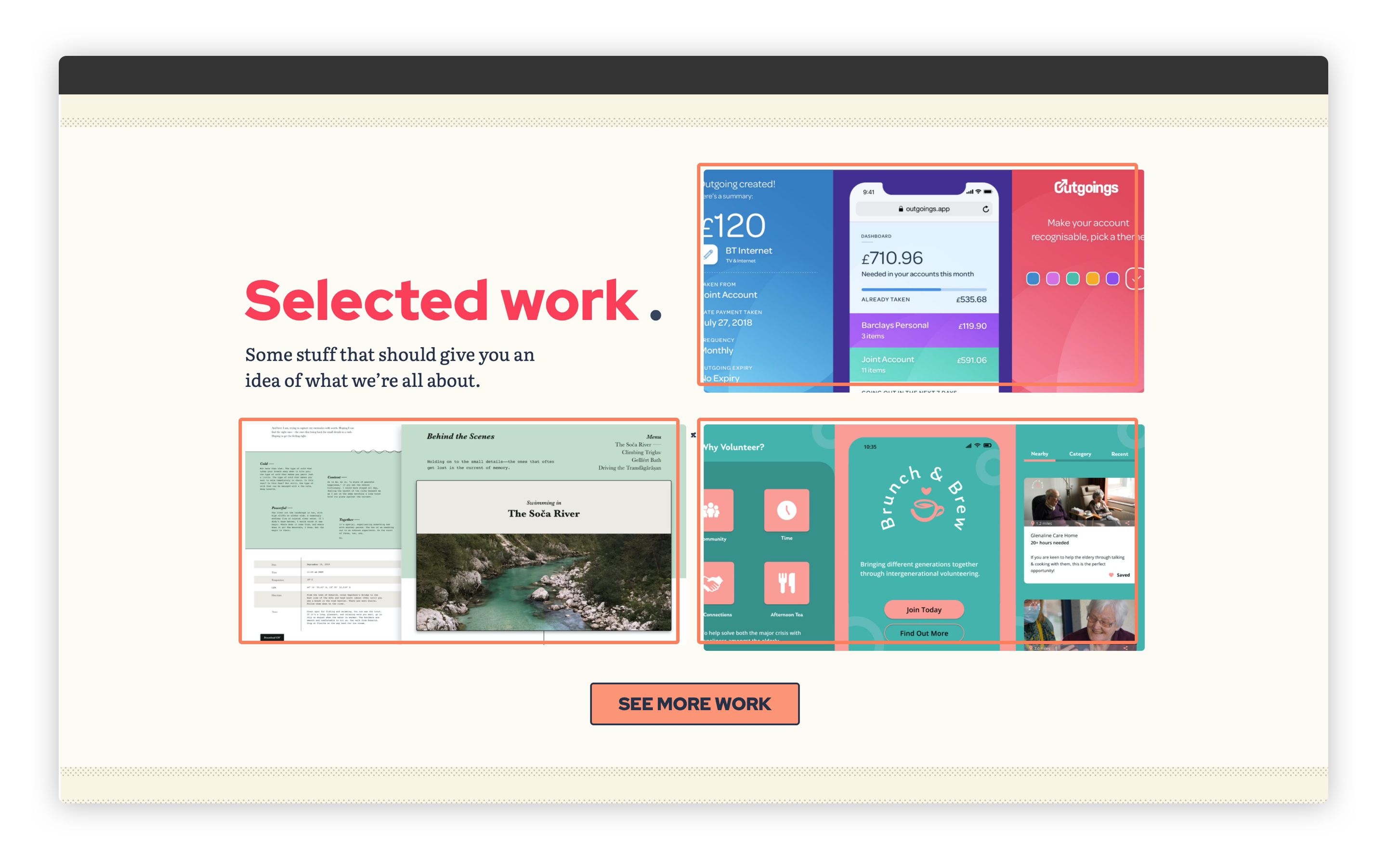
Now, when you load up http://localhost:8080 (opens new window) and scroll down to the work feed, it should look like this:
# Studio feed
Last panel now. The remote data feed that loads in our “studio images” that we definitely didn’t just grab from Unsplash 👀
This is an overflow scrolling panel that a user can scroll using either a scrollbar, which appears automatically, or a swipe gesture, if available. We can do all of this with CSS, so we don’t need to bother kludging up the browser with JavaScript.
Create a new file called in your blocks folder called _studio-feed.scss and add the following to it:
.studio-feed {
  &__list {
    display: flex;
    overflow-x: auto;
    -webkit-overflow-scrolling: touch;

    > * {
      width: 16rem;
      height: 13rem;
      flex-shrink: 0;
      padding: 0 0 get-size('400') 0;

      img {
        width: 100%;
        height: 100%;
        object-fit: cover;
      }
    }

    > * + * {
      margin-inline-start: get-size('500');
    }
  }

  @include media-query('md') {
    &__list {
      > * {
        width: 28rem;
        height: 17rem;
      }
    }
  }
}
What we’ve done here is make the &__list have overflow: auto and then add flexbox with no wrapping. This is the default behaviour, because flexbox will keep trying to fill space, even if it isn’t technically there. With this in place, we now have a (don’t make me say it) carousel.
We explicitly size each item to keep things nice and consistent because each image could rightly be a random size. We just don’t know at this point, so we should be writing our CSS with that in mind.Because we’re explicitly sizing each item, we use object-fit: cover which prevents the image from looking squashed. This is because the browser will size the image within the bounds of the image so it’s cropped at the centre.
All we do then is increase the size of these images at larger breakpoints.
Let’s add that to our home critical CSS. Open up eleventy-from-scratch/src/scss/home.scss and at the end, on line 13 add the following:
@import 'blocks/studio-feed';
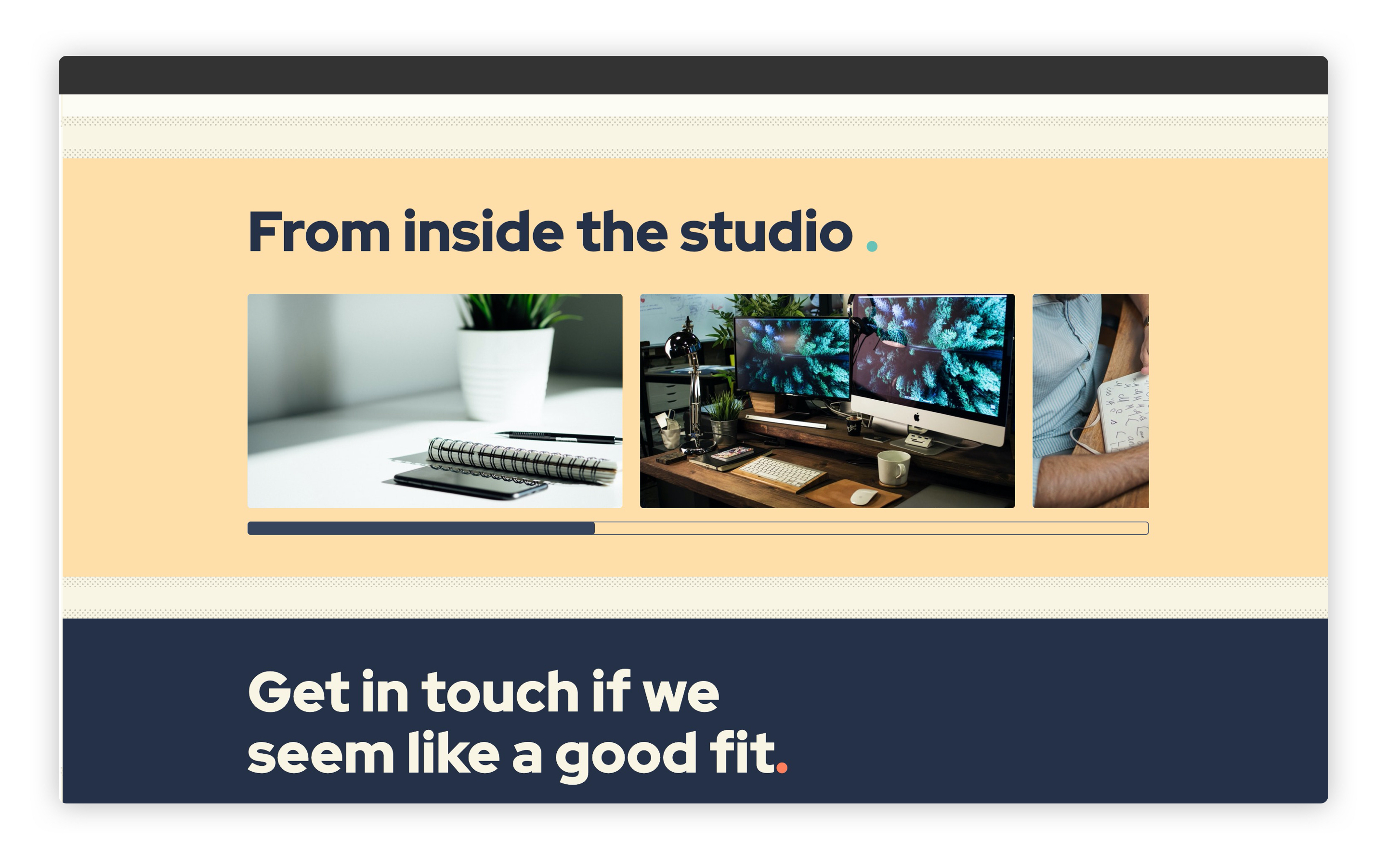
Now, if you load up http://localhost:8080 (opens new window) and scroll down to the studio feed, it should look like this:
# Wrapping up
That’s our home page styled up! We’ve also got most of our site’s styles written now, so all we have to do is visit some of the other sections, add some compositional styles and then we’re done.
Let’s tackle the blog next.