# Lesson 27: Styling the blog
We’re getting very close to the end now and our site is starting to look really nice. Let’s tackle the whole blog section in this lesson.
# Creating a page header block
This block is almost hilariously tiny. Because of our CSS methodology—CUBE CSS (opens new window)—we only have to add 3 lines of CSS here.
Create a new file in your blocks folder called _page-header.scss and add the following to it:
.page-header {
  padding: get-size('800') 0;
}
Nice and easy. Let’s add that to our critical CSS. Open up eleventy-from-scratch/src/scss/critical.scss and add the following, with the other block @import statements:
@import 'blocks/page-header';
# Creating a post list block
As we know from when we built this earlier in the course, the post list is a list of links to blog posts. All of the surrounding styling has been accounted for with pre-generated design tokens—via Gorko (opens new window)—but we’re going to add a block of directly applied design tokens.
Create a new file called eleventy-from-scratch/src/scss/blocks/_post-list.scss and add the following to it:
.post-list {
  &__link {
    font-size: get-size('700');
    color: get-color('dark-shade');
    text-decoration-color: get-color('primary-shade');

    @include apply-utility('font', 'sans');
    @include apply-utility('weight', 'bold');

    &:hover {
      color: get-color('primary-shade');
      text-decoration-color: get-color('dark-shade');
    }
  }
}
You might be wondering why we’re applying design tokens like this. Similarly to the .button, if there will be state changes to design tokens, I personally prefer to set them all in the same place—in the block itself. It’s mainly to reduce the amount of surprises when you come back to maintain the code several months after you have written it.
We’re going to create a new critical CSS file for “pages” for all of this stuff, so create a new file in your scss folder called page.scss and add the basic scaffold to it:
// First up: config and functions
@import 'config';

// Set Gorko to output no CSS for this file
$outputTokenCSS: false;

// Next: pull in Gorko for design tokens
@import '../../node_modules/gorko/gorko.scss';

// Generic styles
time[datetime] {
  display: block;
  color: get-color('primary-shade');
  font-size: get-size('700');
  font-style: italic;
}
This is just like when we created home.scss. The only difference here is—like with critical.scss—we add some generic HTML styles.
After all of that code, add the following:
// Pull in blocks
@import 'blocks/post-list';
Now we need to add that to our page. First, open up eleventy-from-scratch/src/_includes/layouts/feed.html and add the following on line 2:
{% set pageCriticalStyles = ['css/page.css'] %}
Then, open up eleventy-from-scratch/src/_includes/layouts/post.html and add the following to line 2:
{% set pageCriticalStyles = ['css/page.css'] %}
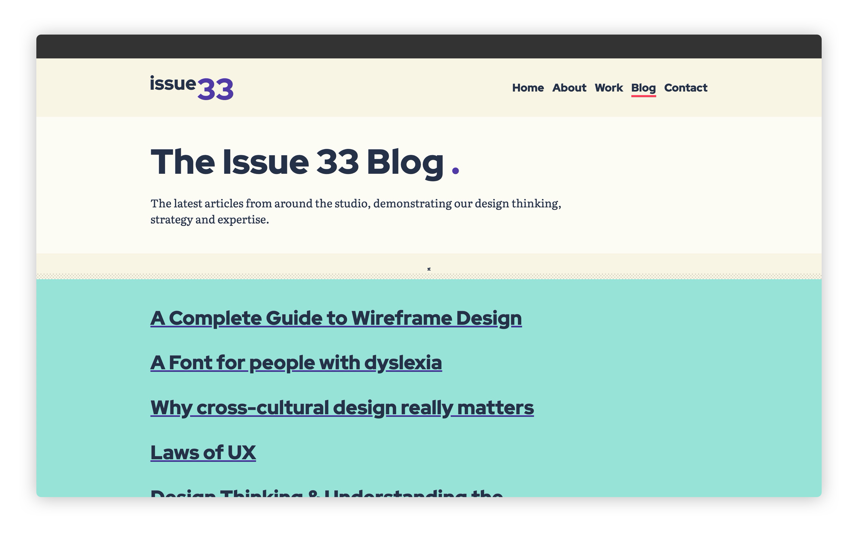
Now, if you load up http://localhost:8080/blog (opens new window) it should look like this:
# Creating a pagination block
The last part on our feed pages is pagination links. Create a new file in your blocks folder called _pagination.scss and add the following:
.pagination {
  &__inner {
    display: flex;
    justify-content: space-between;
    flex-wrap: wrap;
  }

  // Pushes a sole "next" link out to the right
  &__inner > [data-direction='forwards'] {
    margin-inline-start: auto;
  }
}
Another mini compositional block here. We make the links push away from each other using flexbox and justify-content: space-between.

A handy trick, though, is when the [data-direction="forwards"](which is our next posts links) sits on its own, we add margin-inline-start: auto. This pushes the item out to the right, even if there’s not a sibling to push against. Consider this Andy’s trick of the day™.
Right, let’s add that to our page critical CSS. Open up eleventy-from-scratch/src/scss/page.scss and right at the bottom, add the following:
@import 'blocks/pagination';
That’s our feed pages done. I love this part of a front-end build, using this sort of methodology, because you can get things styled up really quickly.
# Styling our blog posts
Let’s turn our attention to the blog post now. What I like to do is create a block that handles standard content, like you would get in a blog post, or just a generic page. Let’s create it, then I’ll explain what we’re working with.
Create a new file in your blocks folder called _page-content.scss and add the following to it:
.page-content {
  @include apply-utility('leading', 'loose');

  > * {
    @include apply-utility('measure', 'long');
  }

  blockquote {
    border-inline-start: 1rem solid get-color('quinary');
    padding-inline-start: get-size('600');
    padding-top: get-size('500');
    padding-bottom: get-size('500');
    font-style: italic;
  }

  h2 {
    font-size: get-size('700');
  }

  h3 {
    font-size: get-size('600');
  }

  ol,
  ul {
    padding-inline-start: get-size('800');
  }

  li + li {
    margin-top: get-size('300');
  }

  // Add a greater flow space for heading elements so
  // they appear more like article sections
  h2,
  h3 {
    --flow-space: #{get-size('800')};
  }

  // Add tighter flow for elements that follow a heading
  h2 + *,
  h3 + * {
    --flow-space: #{get-size('300')};
  }
}
The first thing we do is grab all direct children of this block and limit their line length. The measure-long utility limits the width of a line to 65ch, which is a nice readable length.
TIP
A ch unit is equal to the width of a 0 in the selected font. It’s a great unit for typesetting because instead of using pixels or rem units, we’re using the actual type sizing to make sure things look good. This also means regardless of font-size, the ch unit will be relative to the font, which is handy.
After we set the line lengths, this block mainly targets specific elements and either changes their font size or their flow space. The --flow-space change makes the .flow utility apply different spacing to specific elements. Because CSS Custom Properties are affected by the cascade, it’s really useful to make contextual changes to a utility without directly targeting it. Good ol’ CSS!
Let’s add that to our critical page CSS. Open up eleventy-from-scratch/src/scss/page.scss and add the following right at the bottom:
@import 'blocks/page-content';
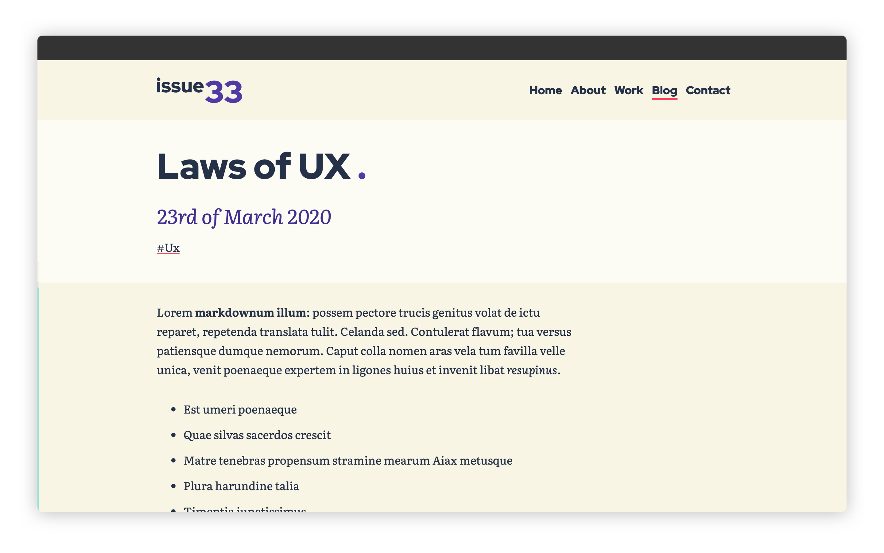
Now, when you look in your browser at http://localhost:8080/blog/laws-of-ux/ (opens new window), it should look like this:
You’ll also notice that the “More from the blog” section is completely styled too. That’s because we’ve handled all of that stuff earlier in the post.
# Wrapping up
This is becoming a real sprint finish to the end of this course now. Our site is starting to look really good.
Let’s keep this momentum up and tackle some low hanging fruit: the about page!