# Lesson 30: Styling the work section
Here we are—the last lesson of the Front-End Build module. Let’s go out in style and apply what we’ve learned about CUBE CSS (opens new window) to make the work section look ace.
We discussed in the last lesson how, even now, the work section looks good. That’s down to a combination of the CSS methodology and a progressive enhancement approach.
The beauty of progressive enhancement is that, even before you enhance, it looks absolute fine. That’s because you’ve already produced a solid minimum viable experience (opens new window).
# Styling the work page
Let’s turn our attention to the work page, where each work item is displayed. We’re aiming for another staggered layout.
Create a new file in your blocks folder called _gallery.scss and add the following to it:
.gallery {
  display: flex;
  flex-direction: column;

  &__media {
    max-width: 40rem;
  }

  // Indents the even children along the inline-start to acheive a staggered
  // layout where space permits
  @include media-query('md') {
    &__item {
      &:nth-child(even) {
        margin-inline-start: auto;
      }
    }
  }

  // Flip each item to be a flex item to align caption and
  // image together
  @include media-query('lg') {
    &__item {
      $gallery-item-space: get-size('700');
      display: flex;
      align-items: flex-end;

      // Flips the horizontal layout. Use this with care though,
      // because changing source order can be problemetic
      // for keyboard users
      &:nth-child(odd) {
        flex-direction: row-reverse;
      }

      // A specificity trump that makes sure that each item
      // has a neg start margin
      &:nth-child(odd),
      &:nth-child(even) {
        margin-inline-start: -$gallery-item-space;
      }

      > * {
        margin-inline-start: $gallery-item-space;
      }
    }
  }
}
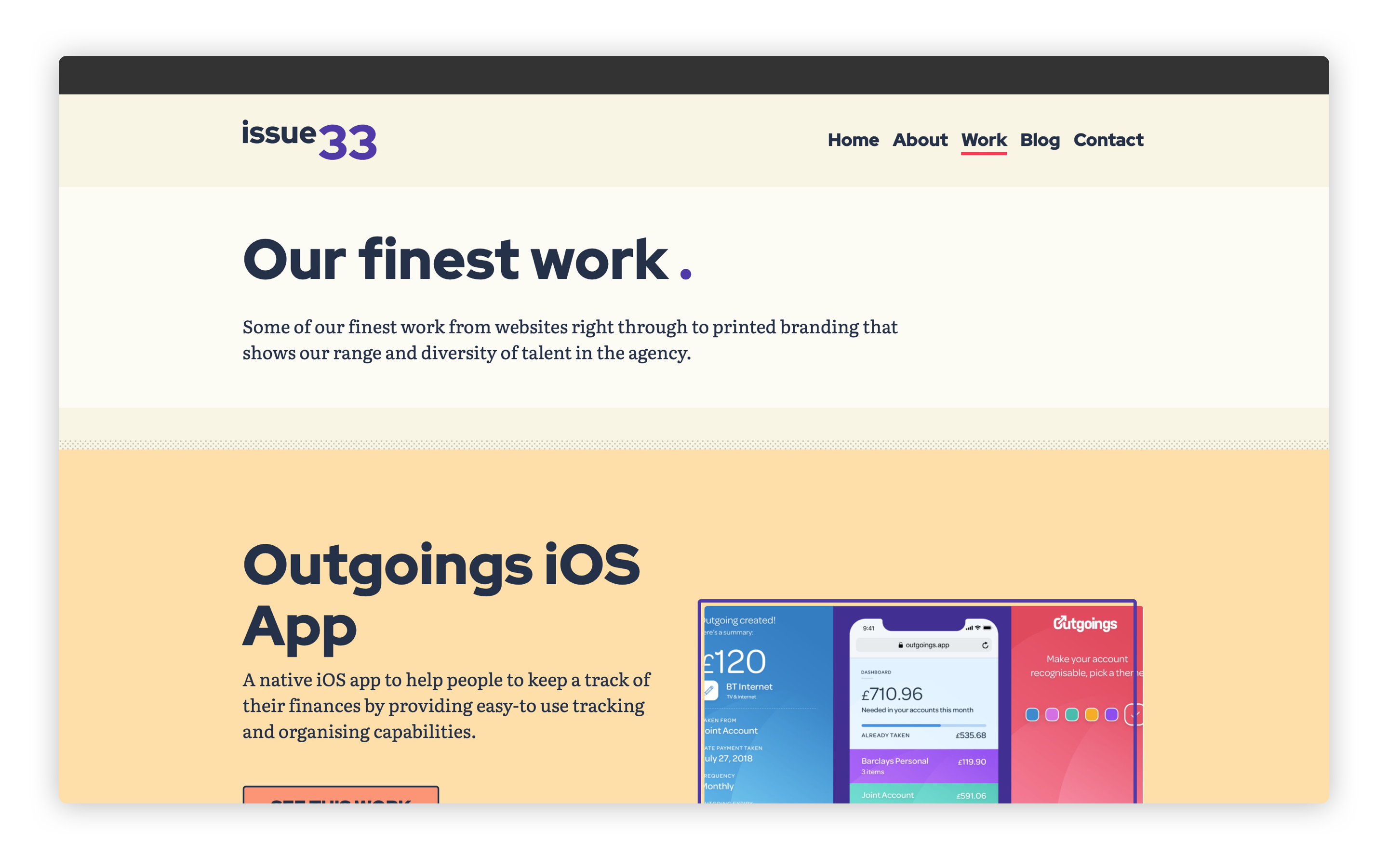
This very much does the same thing that our home page work feed does. It’s a little simpler this time, though, because we don’t need to expand it into a multi-column grid layout.
We’re still using flexbox, though. This is because the auto margin (in our case, inline-start) takes the available space calculated by flexbox. Without flexbox, there is no calculated space. Robin Rendle wrote a great post on flexbox and auto margins on CSS Tricks (opens new window).
Let’s add this to our critical CSS. Open up eleventy-from-scratch/src/scss/critical.scss and add the following, with the other block @import statements:
@import 'blocks/gallery';
If you go to http://localhost:8080/work (opens new window) it should now look like this:
# Styling work items
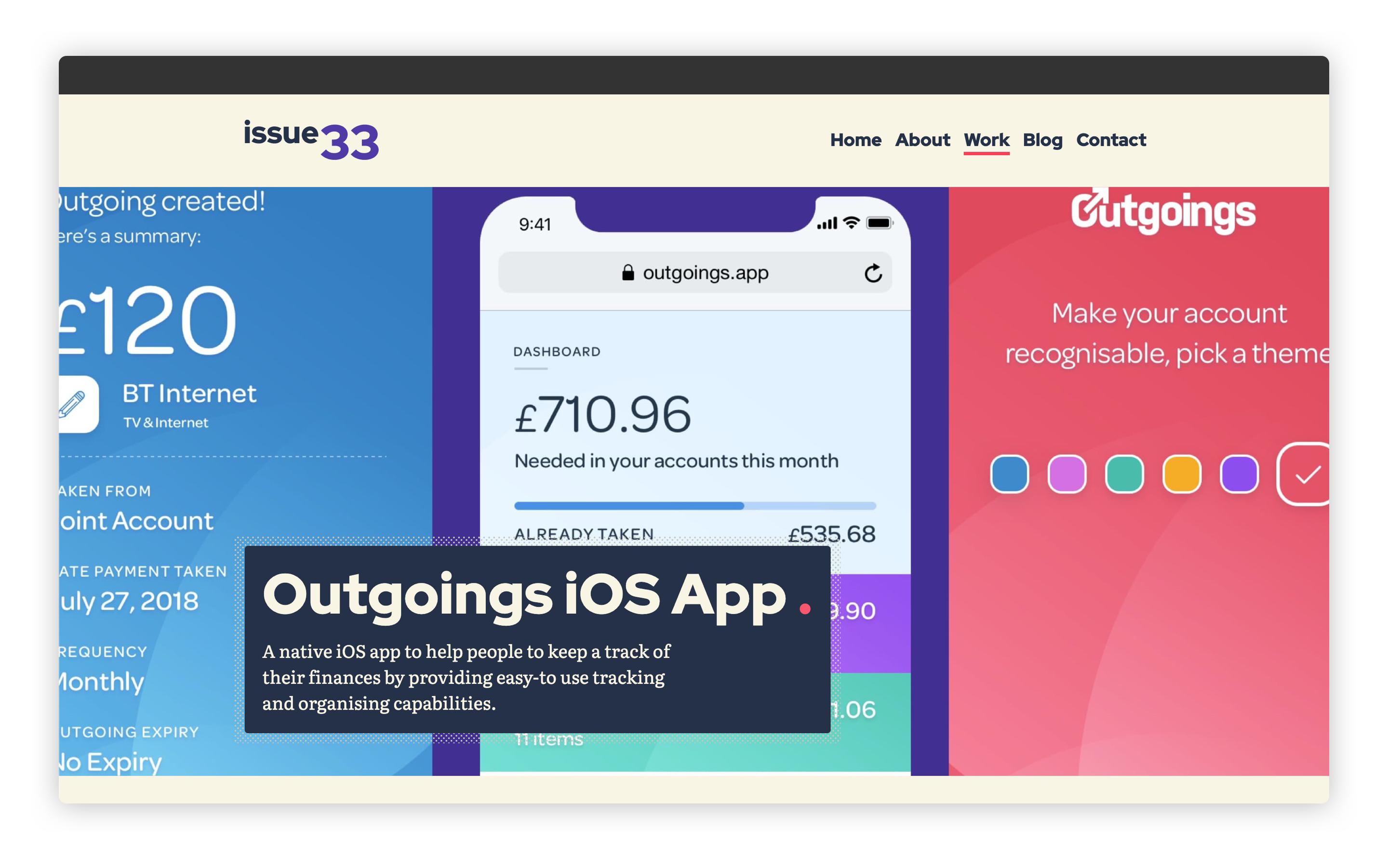
The last bit of CSS is to tweak the work items. The first thing we need to add is a compositional block that lays out the hero element.
Create a new file in your blocks folder called _hero.scss and add the following to it:
.hero {
  position: relative;
  padding: 50vh 0 get-size('800') 0;

  &__image {
    width: 100%;
    height: 100%;
    position: absolute;
    top: 0;
    left: 0;
    object-fit: cover;
  }

  &__inner {
    position: relative;
    z-index: 1;
  }

  &__content {
    display: inline-block;
    padding: get-size('500');
  }
}
What we’re doing here is creating a padded container, which contains our hero image and headline. The headline lives inside the &__inner element.
The reason we create this padded container is twofold. Firstly, we want the hero to be a specific height. This is calculated by combining 50vh—which is half of the viewport height—and a spacing unit. The reason we don’t use calc for this is because we want the spacing unit to lift the &__inner element, which will be pushed down by the 50vh top padding.
That’s the hero sorted. Let’s now add a compositional block for the key facts section.
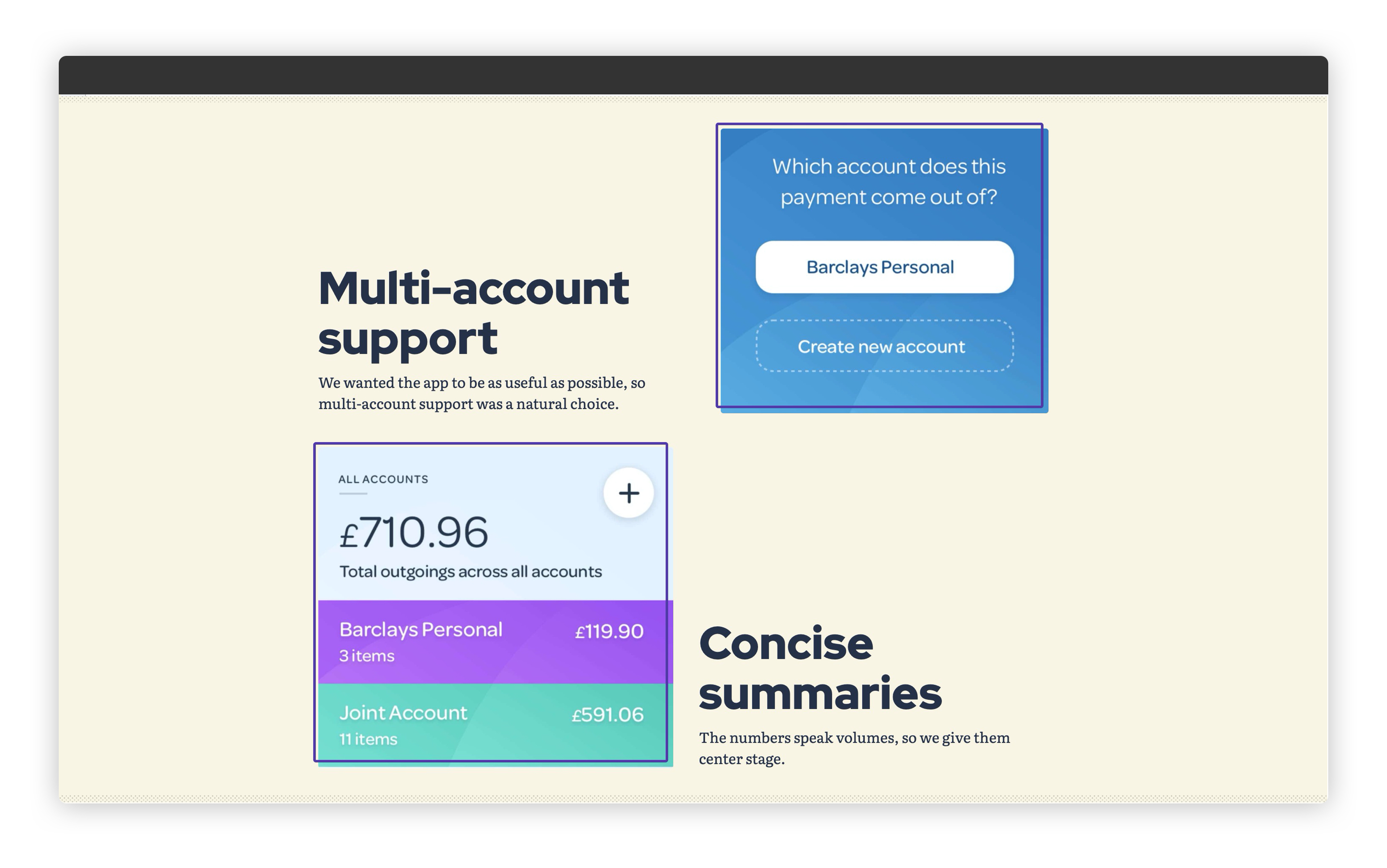
Create another file in your blocks folder called _key-facts.scss and add the following to it:
.key-facts {
  --auto-grid-gap: #{get-size('800') get-size('500')};

  li > * {
    display: block;
  }
}
This is just like the .people compositional block we made a few lessons ago. This also uses the handy .auto-grid utility and we’re adding a specific row and column gap, using the gap shorthand. Finally, we set all direct children of a list item to be a block item. That’s how we get our number and label to sit on top of each other.
These two new blocks are very specific to work items, so let’s add our last critical CSS. Create a new file in your scss folder called work-item.scss and add the following to it:
// First up: config and functions
@import 'config';

// Set Gorko to output no CSS for this file
$outputTokenCSS: false;

// Next: pull in Gorko for design tokens
@import '../../node_modules/gorko/gorko.scss';

// Pull in blocks
@import 'blocks/hero';
@import 'blocks/key-facts';
All we have to now is link this up to our layout, so open up eleventy-from-scratch/src/_includes/layouts/work-item.html and add the following to around line 2:
{% set pageCriticalStyles = ['css/work-item.css'] %}
Now, when you go to http://localhost:8080/work/outgoings/ (opens new window), it should look like this:
When you scroll past the hero section, it should look like this:
# Wrapping up
That’s our front-end done! Doesn’t it look good?
Let’s just pause for a moment before we move onto the last level and think about what you’ve achieved. 30 lessons ago, you started out with nothing, and now you’ve built a stunning website with Eleventy and front-end best practices.
I’m super proud of you for getting this far.
Let’s do our lap of honour now and get this thing ready to go live in the next, and final lesson.